Director of UX
@ Study.com
Study.com is an online education company, built on a platform of video learning content that supports K-12, college students, adult learners, parents, teachers, and professional development.
I served as the Director of UX for 3 years. During this time I converted the company from an engineering-led product development process to a human-centered product design process.
Organizational Change
I was hired into this successful 20-year-old company as the first Director of UX to transform the Product team from an engineering focus to a more user-centered UX focus.
This change encompassed all levels of the organization - from the CEO to the product managers, engineers, and design team. I was able to successfully shift the product development process by imbuing a focus on user research, UX design, and prototype testing before engineering efforts. I changed the company-wide understanding of design from “that stuff you do at the end to make it look good” to “this is how we develop products.”
Design Management
I shifted the design team's focus from UI to UX through mentorship, professional development, and inspirational leadership. I was a strong advocate for every team member and created a partnership between Design and Product.
The outcome was a design team that could lead their own product design workshops, advocate for research and prototype testing, and hold their own as leaders on their respective scrum teams.
To mitigated the effects of pandemic remote work, I developed a series of team “inspiration” meetings, quickly building rapport with both the design team and my cross-functional colleagues.
Design Ops
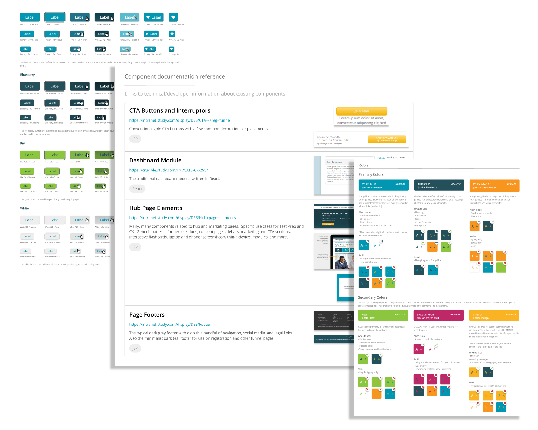
I standardized the UX team tools (Figma, Miro), developed the first company design system, and implemented formal design reviews with scrum teams and senior management.
I introduced design workshops, including Google Ventures-style Design Sprints, to help solve our most intractable product challenges. In addition to helping us find design solutions, these sprints introduced the practice of UX design to more members of the Product team.
Hub Pages for New IA
As an SEO-driven company, Study.com needed to update our Information Architecture to better reflect how Google determined site value. This new IA required a set of new hub pages built around our academic subjects.
What I did
I worked with the PM, VP of Product, COO, and CEO to determine the logical set of pages and page connections based on our new IA. I encouraged senior management to rethink their SEO assumptions based on all of our new research, which led to significantly simpler pages with fewer links and less content.
What my team did
Once we had a skeleton IA for the individual pages, I coached a Senior Designer through the development of a visual design language and hierarchy that accomplished our IA goals.
The result
After launching the new hub pages, the new sections of our site began to quickly attract SEO attention, leading to more site visits and conversions.
State standards skills assignment
Study.com began focusing more heavily on B2B sales to school districts. This required us to incorporate state standards in a more direct way, allowing teachers to create assignments based on particular standards.
What I did
I collaborated with our Content, Product, and Design teams in the development of new standards-based skills content.
What my team did
My UX Designer interviewed teachers and did a competitive analysis, resulting in the basic IA and user flow. They then prototyped assignment pages, tested them, and iterated under my management. This led us to a simplified page that included integrated help.
The result
The skills content and assignment flow were table stakes for Study.com to sell to school districts throughout the U.S.
Teacher Tools
Although teachers have always been an important audience for Study.com, teacher-specific tools and features had been hidden and confusing. The goal of this project was to simplify and improve the teacher experience, leading to increased usage of some of these high-value features.
What I did
I worked with the Designer to help advocate for preliminary user research. I encouraged using more color - working within our design system while still pushing at the edges.
What my team did
The Designer completed interviews with existing teacher customers to understand their needs and struggles; determined which features needed to be moved up the page hierarchy; and incorporated our tertiary color palette in a new and effective way.
The result
After launching the redesigned teacher tools, our customers reported a better understanding of the product’s capabilities and we saw increased usage of some of the key tools.


